Minimal Desktop Setups
Product Hero Page Redesign
Role : UX/UI Designer
Platforms: Desktop & Mobile
Tools: Figma
Project Type: Ecommerce / Product UI
Summary
I have worked with Minimal Desktop Setups on quite a few projects, with the most recent one being designing a new landing page for their Planner product, on both desktop and mobile view. The goal was to improve first impressions, product visibility, and user engagement—especially on mobile, where the majority of their audience browses.
The Problem
They were launching a new physical planner and needed a strong hero section for both desktop and mobile that:
clearly introduced the product
highlighted key features
matched their minimal, clean aesthetic
worked seamlessly across desktop and mobile
Goals
Goals that were set to achieve though this project:
Clearly communicate what the product is
Increase engagement with feature highlights
Improve readability and visual hierarchy
Create a unified experience across desktop and mobile
Research & Insights
I conducted a brief competitor analysis across:
premium stationery brands
minimalist eCommerce stores
hero sections for newly launched products
Key findings:
Successful planner landing pages use bold hero imagery and simple messaging
Product feature icons and clear photos drastically improve engagement
Clean spacing and strong typography are critical for clarity, especially on mobile
These insights guided the redesign.
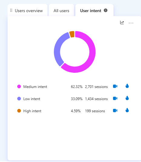
User Intent Analysis — Microsoft Clarity
Pre-redesign session data revealed that 62% of users were medium intent browsers — indicating users were exploring but not converting. Only 4.59% of sessions showed high purchase intent, suggesting significant friction in the product discovery experience. This data informed the decision to prioritise clearer product presentation and a simplified navigation hierarchy in the redesign.
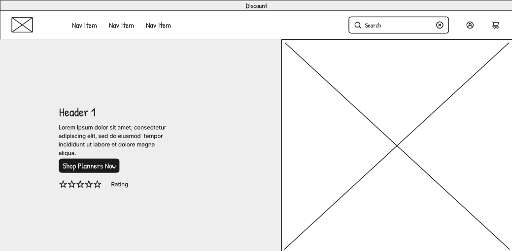
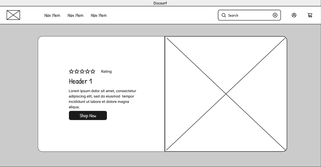
Wireframing Desktop
I explored and developed multiple layout structures for:
Product image placement
Product slogan
CTA and information placement on mobile
button placement and pathway
Customer testimonials
These main points were the main focus to ensur users immediately understood what the new planner offers and why it matters.
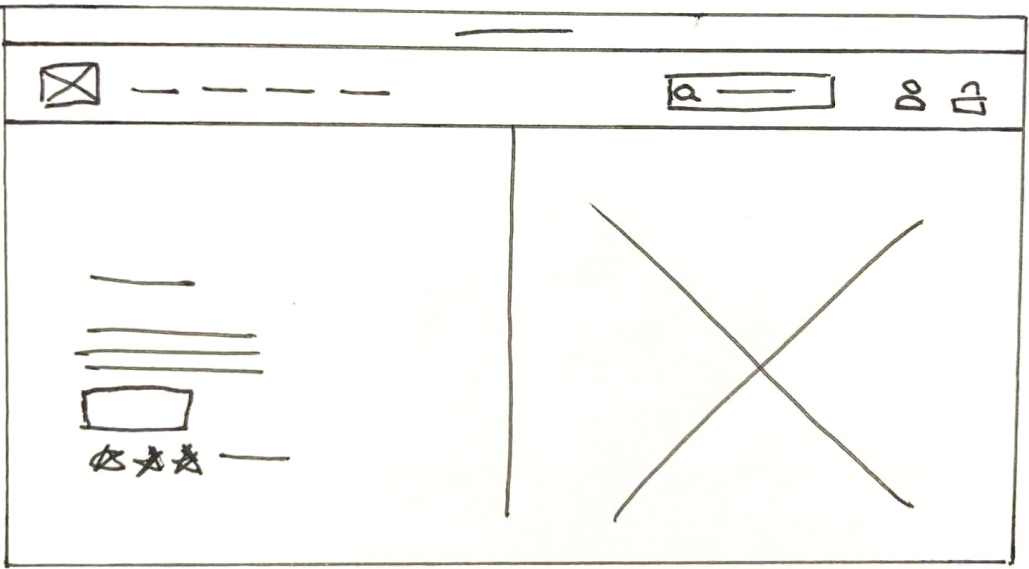
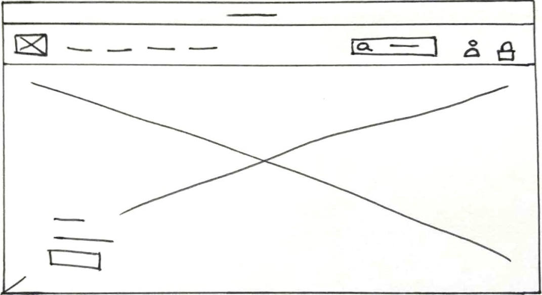
Paper Prototype 1
Low-Fidelity Prototype 1
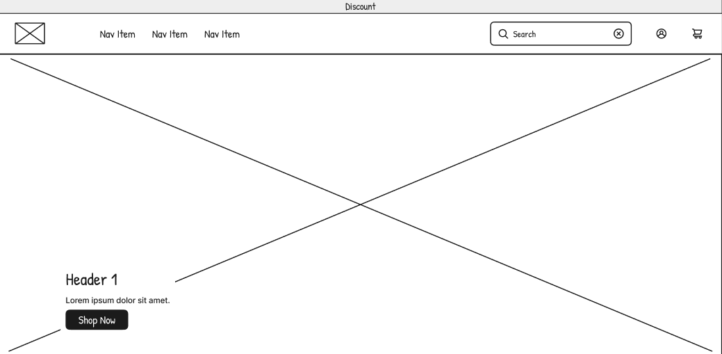
High-Fidelity Prototype 1
Paper Prototype 2
Low-Fidelity Prototype 2
High-Fidelity Prototype 2
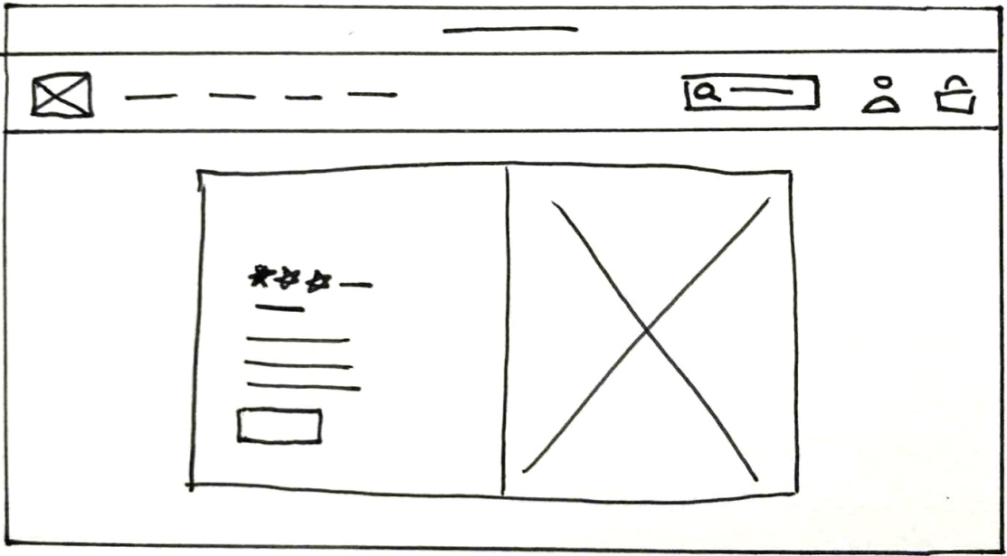
Paper Prototype 3
Low-Fidelity Prototype 3
High-Fidelity Prototype 3
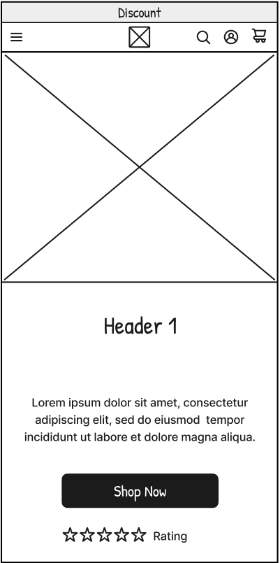
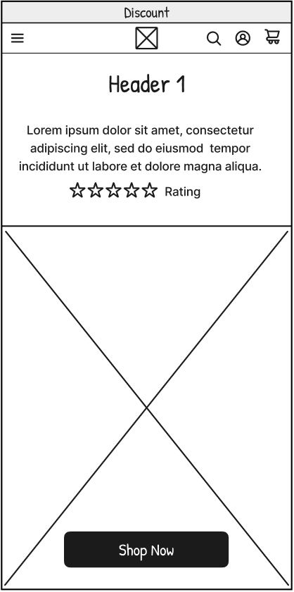
Wireframing Mobile
Similar hierarchy was explored and developed for the mobile design:
hero imagery placement and sizing
How much CTA and information to display on mobile
‘shop now’ button size and placement that leads into product
Low-Fid 1

High-Fid 2
Low-Fid 2
High-Fid 2
Low-Fid 1
High-Fid2
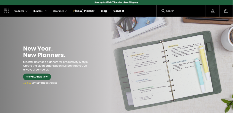
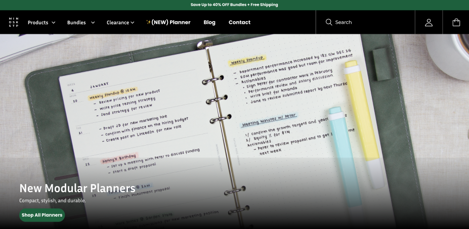
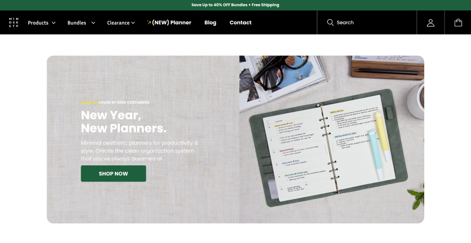
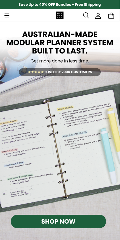
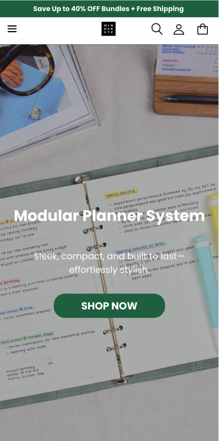
Final UI
The final design used:
strong visual hierarchy
Spacing based of information priority and hierarchy
CTA with strong visibility placed for conversions
minimal, modern typography consistent with the brand
Clean, impactful hero image showcasing the planner
Clear messaging with strong value proposition
Consistent layout adapted to desktop and mobile
Results
Following the redesign, A/B testing conducted by the development team showed user interaction rates improved by 1.5x, with further gains observed after the full launch. Post-launch heatmap data from Microsoft Clarity reinforced these findings — showing strong engagement concentrated around the product imagery and key purchase elements, with click clustering around the product carousel and "Add to cart" zone indicating users were successfully reaching and acting on core conversion areas.
Beyond the numbers, the updated hero delivered cleaner product presentation, improved mobile clarity, and stronger alignment with the brand's minimal aesthetic — reducing friction in product exploration and directing attention more effectively than the original layout.
What the heatmap shows
Strong click clustering around the product image carousel — users are actively engaging with product exploration
"Add to Cart" zone shows consistent interaction — core conversion element is visible and reachable
62% medium intent sessions indicates strong browsing engagement — users exploring, not bouncing
Reduced scatter across non-essential elements compared to the original layout
Before
After
Reflection
This project strengthened my understanding of:
designing high-impact hero sections
mobile eCommerce design
balancing brand aesthetic with conversion-focused UI
structuring product information for clarity
It also reinforced the importance of strong visual hierarchy and readability—especially when working with mobile users.